Welcome

Welcome to my media blog, where you will find all the work I have done for my media A Level. I am Harry Kettenis (0390). On the right side of the blog you will find labels that can be used to navigate through my blog, please ignore the "AS Work" label. I am working in a group with Ysabel Hudson-Searle (0331), Matthew Romo (1660) and Josh Stevenson (0796).

Artefacts


Our Music Video


Our Digipak Cover


Our Website

Tuesday, 13 January 2015

1. In What Ways Does Your Media Product Use, Develop Or Challenge Forms And Conventions Of Real Media Products?

Throughout the construction of our project we followed many real media conventions. This was done so that the audience felt a sense of familiarity watching our music video and consuming our other texts. Despite this, we also challenged some conventions due to our project's unique style.

MUSIC VIDEO

Our music video is performance and narrative based, with the inclusion of some conceptual shots.
Performance - A combination of singing and dancing.
Narrative - A story that develops as the music video and song progress. This visually expresses the themes expressed.
Concept - Abstract shots that act as visual symbols for the motifs included in the video.

Some texts we used as references for our video were:
  • Beyonce - If I Were a Boy
  • Rihanna - We Found Love
  • Miguel - Adorn
  • Rihanna - Pour It Up
  • FKA Twigz - Tw-ache 

Genre

Our music video falls within the R&B genre, more specifically, the PBR&B genre. We recognised Andrew Goodwin's theory that in music videos, as well as the creation of an artist, there are common themes, styles and iconography that are related to each genre. This led is to follow a number of conventions that we found through our research, were ever present throughout the genre.

One theme that is common to the R&B, and more specifically PBR&B genre is that of love, relationships and heartbreak. We followed this common theme in our own music video. This was done through, not only the narrative which is an obvious relationship that falls apart, but also through the emotion shown through the performance side of the video. This is also shown in "Drunk in Love' by Beyonce and Jay Z where the intimacy of their relationship is clearly shown in the video. By including this theme in our video, our audience feel a sense of familiarity as this is what they are used to in the genre.

Beyonce - Drunk In Love


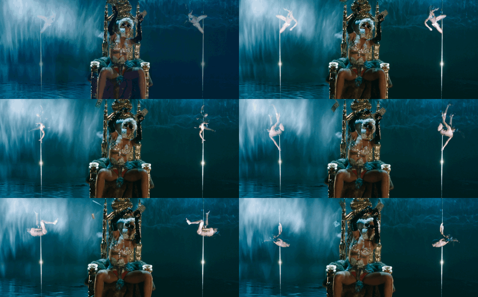
Typically, in PBR&B music videos, the locations are very grand and signify wealth. This is the case in Rihanna - 'Pour It Up' shown to the right. We broke this convention in our video due to our plain and simplistic settings. In almost all of our performance shots we used a black or white background with very few props, relying on simple yet effective lighting. This was done in order to allow the audience to relate to Roza, not as an artist, but as a personality.

Form

Goodwin claims that in the industry there is a need for a lot of close ups of the artist that act as visual hooks. We recognised the importance of these 'money shots' and used our most impressive close up as the performance bed for our video. This point is also brought up by Carol Vernallis who also highlights the importance this close up that is used frequently.

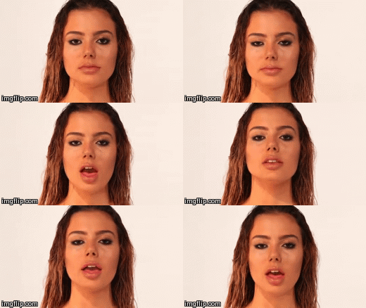
Beyonce wet look in 'If I Were A Boy'
Our own wet look used in our video

We took inspiration directly from another R&B video: Beyonce's 'If I Were A Boy.' As shown, we emulated this close up in our own video.

The editing style of music video was another convention that we followed in the construction of our video.


Vernallis also highlights the conventional use of camera movement in music videos. In our music video, camera movement is used as a means of increasing the intensity and speed. As shown to the right, it is used during an argument scene in the narrative part of the video. This further engages the audience, almost making them feel as though they are in the room with Roza and her boyfriend, witnessing the argument.


The video for 'Adorn' by Miguel inspired us to use this type of movement. It is shown below and adds another element of depth and movement to, what would be, a quite static shot, without this camera movement.


Lyrics, Music, Visuals

Goodwin identifies the link between lyrics, music and visuals in songs and music videos and recognises the way in which visuals can illustrate, amplify or even contradict the lyrics and music.


We used a visual narrative in our video which directly illustrate the meaning of the song. Through the lyrics it was understandable that Roza had gone through a tough relationship and our narrative expressed this. The emotion shown through our performance shots, as well as the visuals, such as fire, that symbolised these emotions, amplified the meaning of the lyrics and music.


One real life example of visuals being used to illustrate and amplify the lyrics of a song is 'Wrecking Ball' by Miley Cyrus, shown to the left. She describes herself as a metaphorical wrecking ball in the song, however, she says this while actually riding on a wrecking ball.


Intertextual References

As mentioned above we referenced a globally famous video - If I Were A Boy, but also had some other inspirations. Goodwin highlights the inclusion of intertextual references (to films, TV programmes, other videos and many other texts) in music videos.

Being an Urban UK artist, we made reference to 'Street Dance' - a UK dance film. We used this urban costume as inspiration for both our dancing shots and some performance shots. 


We also took inspiration FKA Twigz - Tw-ache (below, right) through the idea of the type of dancing that we had in our music video (below, left). Using this text helped with the choreography of our dance piece and allowed us to brief our dancer on the style that we wanted her to take on.
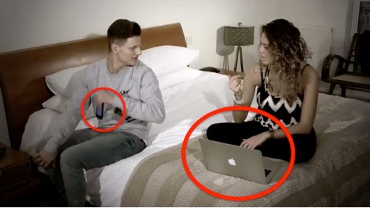


With our secondary audience between the ages of 16-29 we included things that they could relate to. We included a modern smartphone and laptop in our narrative and even more urban clothing. This meant that the 'real life' part of our video was relatable.


Representation

Goodwin also identified the presence of a voyeuristic view of the female body in the industry. This is one convention that we used but also challenged.

The idea of our video was to show Roza in a 'sexy' but not sexualised manner. Through the costume and mannerisms we selected, we were able to show our artist's sex appeal, conforming to the needs of the industry.


However, throughout these shots there was no specific focus on any particular body part. Even our close ups were of Roza's face as opposed to her body. This, therefore, challenged the industry norm, as well as Goodwin's theory, since we removed the view of our artist's body as a sexual object. This shows were we challenged the industry norms.


This portrayal of a strong, independent, female artist who is shown as not at all sexualised would appeal to the female segment of our target audience who, in turn, may feel empowered by this way of portraying females.


ALBUM DIGIPAK

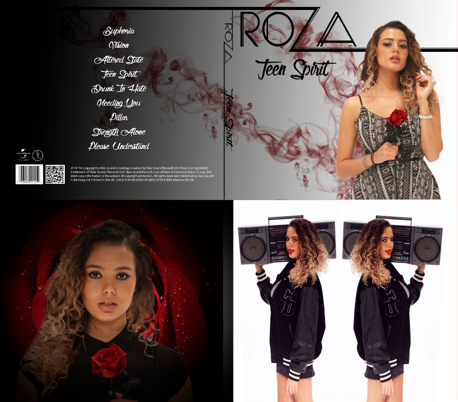
This voyeuristic approach to the female body was further challenged in our digipak, where it is common within the genre, again, for females to be shown as extremely sexualised.


Above are a number of album covers from our chosen genre. There is a common theme of showing off the female body. On all of the album covers the artists are wearing minimal clothing. In our own album cover we challenged this sexual approach and instead our artist wore a more modest outfit.

There are a number of conventions that an album cover must carry in order to carry out its true function. These are shown below, where I compared our album cover with 'My Everything' - Ariana Grande's album.


WEBSITE

2. How Effective Is The Combination Of Your Main Product And Ancillary Texts?

The aim of the three artefacts that we made was to use a synergistic marketing campaign in order to launch our new artist, Roza. For this to be done, there needed to be a single brand created along the video, digipak and website.

Below is a real life example of where this was done through Drake's marketing campaign.


Artist Identity

We needed to give our artist a strong identity in order to make her stand out and become a recognisable brand. Shown below is a word cloud describing Roza's identity.


Roza's identity is also shown through the music video, website and album cover.


Synergy


The Website

The website acted as a central hub for the whole marketing campaign. It was a means of bringing all of our products together, as well as bringing together the methods used to market these products to our target audience.

Learning Opportunities

There were a number of aspects of the website that allowed viewers to learn more about Roza. This was fans would have to access the website in order to find out more, bringing them to the marketing campaign. Some examples are shown below:


Interactivity


Purchasing Opportunities


Symbiosis


3. What Have You Learned From Your Audience Feedback?

Through various stages of the project we got audience feedback from members of our primary and secondary audience for all of our three artefacts. This way we were able to manufacture our products to the wants of the people that would potentially be buying them and buying into the Roza brand.

Below is the profile of a typical member of our primary and secondary audience. We established this early on and tailored our products to the needs of this group.

Appealing To Our Target Audience

When creating our products we needed to ensure that we were able to connect with our target audience, since they were the people who would be consuming them. For this, we used Bulmer and Katz's theory of uses gratifications. This theory states that audiences consume media texts for:

  • Personal relationships
  • Personal identity
  • Diversion
  • Surveillance
Personal Relationships

Fans use media texts in order to build emotional relationships with those that they follow. We used this in our own video, through Roza's directly addressing her fans. This is done through breaking the 4th wall and signing to the camera (and subsequently those watching the video).

Personal Identity

Audiences also use media texts as a means of developing their own identities, possibly through following trends set by their idols. This is done through music, by fans finding elements of themselves in the music video.

Throughout our products, we ensured that we build up a strong and obvious character for our artist and made sure that this character was kept consistent throughout. This allowed fans to emulate Roza's identity, and find elements of their own identities within hers.


Diversion

Fans use media products for escapism from their daily lives. By being immersed in a music video, fans can escape from their real life problems for a brief period. For this reason we had to ensure that we were able to keep fans immersed, by using engaging and exciting imagery, a strong narrative and a high quality music video.

The website also needed to keep fans hooked once they were finished with the video, so the synergy and interactivity, as mentioned in question 2, were vital.

Surveillance

Fans want to learn about, and follow the lives of their idols. This is very possible with the proliferation of web 2.0 as fans can log onto our artist website at any time and follow her activities. For this reason we ensure there were a number of learning opportunities for fans to follow Roza's life and achievements, as well as the release of the album.


Audience Feedback - Construction

It is vital to get feedback from the people who will be consuming the product as this way, you are more likely to create something that they will purchase. Once we felt that we were at a reasonable stage with each of our products we asked for feedback on each.

Music Video

Once we had completed the rough cut for our video we showed it to our primary audience and got some feedback. 


There were a lot of changes that needed to be made:
  • The video felt too disjointed and had no real structure to it.
  • There was too much narrative and this narrative had no clear structure. 
  • The concept shots were too random and looked as though they had just been thrown in anywhere.
  • Our artist's identity was not clear at all.
I showed some members of our primary (and secondary) audience for their opinions on the music video, once the above changes had been made and it had been progressed to what was almost the finished product. The results are shown below.


This time the criticisms that people had were very minor ones. The main feedback we got was to:
  • Use a grey scale or sepia effect on narrative shots to highlight that they happened in the past and they're memories.
  • Be more consistent with editing between shots - slow fades in slower areas, quick cuts in the faster parts of the song.
  • Change the hair flick - remove the reverse effect.
Album Digipak


Shown above is the album cover before changes (left) and after changes (right). The main feedback after showing the first digipak was:
  • Create a stronger link between the front and the back.
Feedback following these changes:


Website

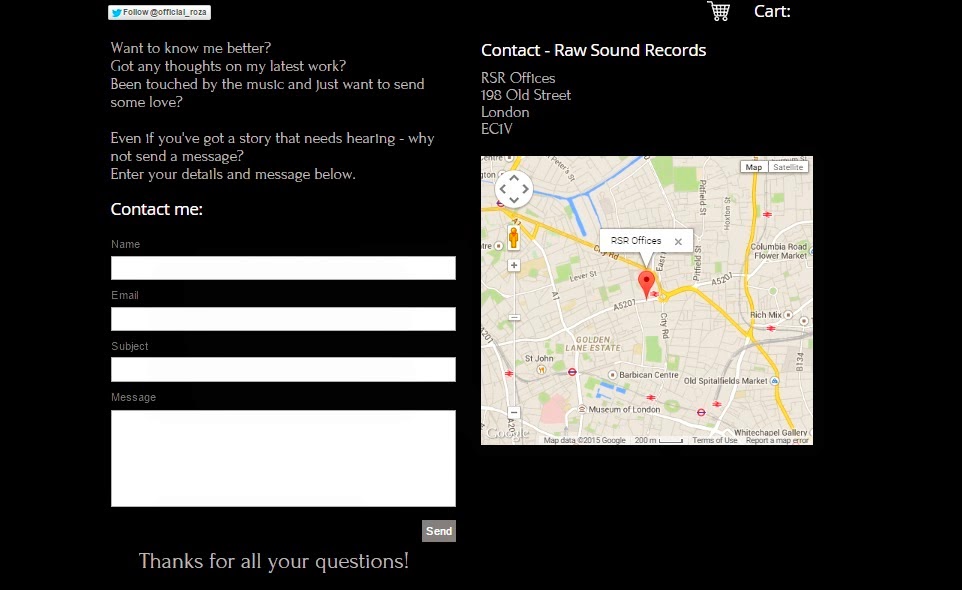
Most people liked our website. They felt that the content was good, however it did look slightly unprofessional in places. For this reason, we made some changes to the 'contact' page. By adding a map to our offices, it created a more realistic looking website. These changes are shown below. Before (Left), after (right).


Audience Feedback - Final Artefacts

Once we had completed the artefact we got feedback on the finished products. This started with a questionnaire on Survey Monkey. This allowed us to get qualitative data as opposed to just quantitive data, making this feedback far more useful.

Music Video

6. What genre(s) of music do you feel the video is for?


The majority of people who took the survey correctly identified the genre of the video. Some even recognising that it was PBR&B specifically. Some guessed that the genre was indie. This may have been due to the slightly unconventional video that contained less glamorous sets than what is typical for R&B songs, as well as the presence of the, more artistic concept shots.


7. What is the video trying to convey?
Almost all of the people asked understood the message that was portrayed through the video. This may have been purely through the narrative, but also through the imagery and emotions that Roza showed. Some did not understand the message of the video. This may have been because the narrative shots were all very quick and they may have missed the end of the relationship at the end of the video.


We got some very positive responses. Audiences did feel that the video worked well with the song and looked professional (considering we did not have the resources or budget of a real institution). There were, however, some qualms with the conceptual shots of the video. Many people did not understand them and know why they were there. Perhaps, throughout the project, we did not consider enough, exactly how people would take these shots in, considering they are very open to interpretation.

We also interviewed a number of members of our primary audience to see what they thought about each of the individual artefacts, as well as they way in which they worked together:

Music Video


The feedback we got was:
  • The video was very visual and worked well with the song. The conceptual shots also enforced this.
  • The narrative could have been improved but was still understood.
  • Roza's character came across well. She was seen as unique, strong and independent.

Album Digipak


The feedback we got was:
  • The artist image and identity were shown well but some mystery was still left.
  • The album was, in most cases, eye catching, leading to further investigation.
  • It was well put together and looked professional.
  • The tracklist was a bit hard to read.
  • Some more mystery could be left, in order to leave fans more intrigued.


Website


The feedback we got was:
  • The countdown on the landing page worked well and encouraged fans to buy the album.
  • It was very interactive.
  • The genre was established well.
  • The interactivity and specific features of the website make it look professional. However, there could be even more interactivity.
  • Again, there were issues with the font.
  • The style of the bio may have put off audiences since they may not have understood it.

Combination/Synergy


The feedback we got was:
  • They worked well together due to the iconography, theme and colour scheme shown throughout.
  • There was a strong sense of synergy felt throughout.

4. How did you use new media technologies in the construction and research, planning and evaluation stages?

Research & Planning

Web 2.0

Throughout the process we used Google and an assortment of websites from image searches to artist websites for references. We also used YouTube to access other music videos from within our genre that we wanted to use as references. We were then able to create playlists with all of these videos and easily access them. This playlist is shown below.


We did not only take videos from YouTube but also uploaded our own videos. These videos showed our ideas and plans as the project progressed. For example, we uploaded animatics and screen tests.


We also used Facebook as a means of communication. We shared ideas we had come up with and set agendas for group meetings.


Here is an example of where I used the Facebook group in order to brief the group on what would be covered in our meetings for the week. This way everyone knew what to expect well in advance.


Phones

We had iMessage and Whatapp group chats where all the members of the group actively communicated. This was the main means of communication that we used as we could instantly send a message at any time, this proved especually useful on the go, where we were arranging meeting times on shoot days.

These group chats were useful for showing each other potential shoot locations. This is shown below, where I suggested to the group a location for the bedroom argument.


iMessage group chat, Whatsapp group chat. Very useful on the go for organisation and sharing media and ideas. We were able to show each other useful locations for the shoot.


Blogger

In the early stages of the project Blogger was used to  observe each others' ideas for the type of video we each wanted to make and find similarities between these. Following this, it was used to log all the progress that was made regarding the project. This was very useful as it was easily accessible from any computer and open for the whole group to see.

Construction - Production

Canon Legria HFG30


This camera was used to shoot the location shots at the start of our shoot, as well as some of the earlier studio shots. It was small and lightweight, meaning that it was easy to transport, especially when manouvering the busy streets of central London. The long battery life also meant we could use it freely throughout the day on location. This camera picked up some excellent HD footage when the lighting was good. 


However, in poor lighting the quality of the shots were affected massively, with high levels of grain. This meant that a lot of our location footage was unusable and we also decided to reshoot most studio shoots on a better quality camera.


Canon 5D

The Canon 5D replaced the Legria as our preferred camera to use for studio shots. This produced much higher quality footage that we were far happier with. This was further amplified by the fact that we could manually control many settings such as exposure and contrast on the fly. This meant that shots looked much more impressive and left less work for post production.

We were also able to use it to take still images. This was useful when taking our promo shots as these were, again, very high quality.

There was, however, one major drawback. Due to department rules and the lack of portability, the 5D could only be used in the studio, meaning that we would be unable to use it for location shots.

GoPro

Due to the technical capabilities of the GoPro, we were able to use it to shoot a lot of footage that the others cameras couldn't. For example, it was the only camera that we had access to that could shoot time lapses, so this was used here. In addition, it had the highest frame rate (120 fps) meaning that we could slow shots down massively. For this reason, we also used the GoPro to take slow motion shots; one of which was the ice smash, shown to the left.

The GoPro was also very small, portable, and durable however, it interface was difficult to use and it was hard to see what was being picked up on the tiny screen. Also, we encountered some problems trying to transfer footage from the GoPro to the edit suite.


Studio Lights

The studio lights were controlled by the Leapfrog Lighting Desk and this was one vital part of our studio shots throughout production. This was very useful and easy to use as we were able to alter the intensity and colour of each individual studio light using the lighting desk. This allowed us to choose the perfect lighting setup and then programme it into the memory of the lighting desk so it could be quickly and easily accessed at any point. 

We also manually moved the studio lights in order to position them perfectly, again, helping us create the perfect lighting setup.

Projector

We also used a projector in our fire performance shots, where we projected an image of fire onto Yssy and the wall behind her. This was good as it made for some extremely good looking shots. However, with any lights on in the studio the images would be drowned out. This meant that we had to light the whole shot entirely with the projector itself so could not control exactly how it would look. Despite this, I feel that the shots came out very well.


Construction - Post Production

Premier Pro

Premier Pro was used to edit the majority of our footage. We could use it to cut our raw shots and put them onto the timeline. This is what we did to begin with, using our storyboard and animatic to decide where we wanted our shots to go. the multi-track layout meant that we could then fine tune exactly where we wanted each shot to start and end. We could also quickly and easily move shots around to wherever we wanted.


We also used a number of tools within Premier Pro, such as the ProCamp and the three way colour corrector to grade our shots. These tools allowed us to edit the colouring, brightness, contrast and saturation of the shots. This was good as it allowed us to create the perfect shot and make it look exactly how we wanted it.

However we did face some difficulties. Some shots, even after we had graded them, were still not of high enough quality. For example, the silhouette shots still appeared dull and the fire poi shots still had too much grain due to the low levels of light.

After Effects

For the reasons expressed above, some shots that still were not of high enough quality after grading in Premier Pro, were taken into After Effects. One shot that was edited in After Effects was the silhouette shot. This was edited using the colour finesse tool and then imported back into Premier Pro.

Using After Effects meant that all of our shots looked much more professional as the grading was much better. One problem we did face, however, was that sometimes after shots were put back into Premier Pro from After Effects they would be corrupted. This meant that we had to delete the shots from the timeline and go back to stage one again, taking the raw footage onto the timeline and re-grading.

Photoshop

Photoshop was used in the creation of our ancillary texts through editing our promo shots for the website and the album digipak. This was extremely useful. Firstly, it meant that we colud remove any imperfections from our promo shots making them look almost perfect and very professional. In addition, when making our album cover, it meant that we could create all the graphics (such as the smoke and the gradient behind it) from scratch. This allowed us to make an album cover that was exactly how we wanted it.

There were however, some issues when editing both promo shots and the album cover. All of our promo shots were shot on white. Because we couldn't entirely remove the white background from the promo shots, especially between Yssy's hair, these shots could not be used on any dark colours. This restricted where we could place these images on our website. There were also difficulties creating the smoke graphic on the album cover. Due to the interface, there was no way of seeing exactly how each part of the graphic would look until it was placed on the image itself. This meant that we had to play a guessing game when creating the smoke graphic. Because of this, it took a very long time s
ince we had to keep going back and deleting graphics that didn't look right at all.


Web 2.0


We used Wix which is an online platform to create websites. This was used to create our artist's website. It was very useful as it was easy to use and we could easily create and move around the different elements of our website so we could see, as we went along, exactly how it would turn out. In addition, Wix had a number of interactive web tools that could be integrated into the website itself. For example, we were able to insert Roza's live Twitter feed on the homepage of our website.


We did, however encounter some problems. Having a website maker that was not based on code did make things easier, but also meant that we did not have entire freedom. Ofter we would not be able to make some of our ideas for the website a reality, since we were restricted to the format of Wix.

Evaluation

Web 2.0

Blogger has been the main platform for logging my progress throughout the project, including the evaluation. It has allowed me to answer the evaluation questions in a number of ways. Blogger has been extremely useful as it can be accessed from any computer with an internet connection and I have been able to pick up exactly where I left off, which has also made editing posts and making changes very easy. Also, Blogger can be used in conjunction with a number of other web tools that can be integrated into posts, making posting a much more visual and interactive experience.


However, these interactive web tools are vital. If blogger is used on its own, it becomes a boring, essay-like experience and is not enjoyable to read.

In order to present my evaluation, I also used a number of other web tools that I embedded into my answers on Blogger.

One of these web tools that I used was Prezi. This is a website that allows you to create interactive presentations. This interactivity was key in making an evaluation that was presented in a much more enetertaining way. Anothe advantage of Prezi is that you can embed videos and images into the slides that are created, again making it much more immersive.

On the downside, animated gifs are not supported on Prezi. This affected me massively when I was attempting to show elements of my video and I had to opt for still images instead.


Slideshare is another website that can be used to make presentations. One massive advantage was that I could create these presentations with Powerpoint, a piece of software that I am very familiar with and then import these directly into Slideshare.

Unlike Prezi, however, Slideshare lacks interactivity as slides are presented like a normal powerpoint. This lack of interactivity is also shown as you cannot move around slides and zoom into videos and images within the presentation. This makes the experience less entertaining and immersive for the reader.


Youtube was a very different means by which i presented the information that I wanted to get across. It could be embedded directly into the blog and shows points much more visually, since I was able to use text and moving pictures to add another element by which I could make my points.


I also used Soundcloud, by uploading voice clips in which I explained my points. This was good as it allowed me to express what I wanted to say more easily and stimulate alternative senses for listeners who would now be hearing my points as opposed to reading them.

However, since Soundcloud is purely based on sound, no images could be used to present information and explanations were sometimes not enough to truly express the point.


Padlet was another visual means of showing my points. It was simply a blank 'board' where images and text could be placed anywhere. It was useful as I was able to place writing alongside images to express points.

However, it was very time consuming and often text would end up underneath images, making it impossible to read. This meant that Padlet took a lot of effort and time in order to create quite a small amount of work.


We used Survey Monkey in order to get get opinions on our artefacts. Survey Monkey is an online questionnaire. This was very useful as we were able to ask any questions we wanted and it clearly showed figures and the responses of people who answered it. It allowed us to get both quantitive and qualitative information from audiences.


Canon Legria HFG30

We also asked our audience some questions directly to, again, gain qualitative information about our video, website and album digipak. For this we used the Canon Legria to record their responses. This meant that not only could people read what responses we got about our artefacts but also visually see what people had to say.